Thursday, June 4, 2015

Final Essay: Samara Golden: The Flat Side of the Knife

                           Samara Golden: The Flat Side of the Knife

        The installation artist I chose from the PS1 Museum is Samara Golden. The installation is called The Flat Side of the Knife. The artist was communicating to the viewers the sixth dimension where the past, present and future exist simultaneously. As the class continued to view the installations in the museum a women who works at the museum told the class Samara Golden inspiration for the installation came from her being close to death in the hospital due to a health scare. 

        Before we even met the women I had no idea what Samara actually meant. I thought this installation had to do with a dream state of mind where our dreams can be contorted and mystical. After the women clarified the meaning I started to understand the concept and what those forms actually meant. The whole installation made me realize this was a hospital room. The wheel chair probably symbolized that she couldn’t walk because of how weak and fragile she was. The musical instruments and the sound could symbolize the love of music and helped her get through this difficult time in her life. The stairs can possibly represent the levels or floors it took for her to get better. 

        This installation is creative because the material she used to help her deliver her idea. The use of the mirrors really helps create illusionary space that also helped create dimension and depth of space while the physical space really help make everything look so real. By combining both illusionary and physical it created a dream that came to life. It really makes you think about what the sixth dimension is and why the past, present and future exist simultaneously. The fact that this installation has two view points it quiet amazing. When you first walk in you see the physical forms pop out and when you look down it looks like the installation is continuing on multiple floors. Then when you walk down to the second floor you realize that there a bunch of mirrors that are giving you that illusion that the installation is continuing, and you see how the mirrors create a picture of the whole installation. This was the main reason why I choose this installation because of how unique it is.

        When I first saw this installation I automatically thought of Harry Potter and the grand stair case often knowns as the hogwarts stairway. It reminded me of something that was unrealistic that came from a children's book. This installation made me realize that anything is possible and can come to life. This installation made me think of my past, present and future and I could understand how they all come together. When I walk up a set of stairs or look at a mirror it constantly reminds me of the Flat Side of the Knife by Samara Golden.
Wednesday, May 27, 2015

Assignment #9 Oral Report Outline

Do Ho Suh was born in Seoul, Korea, in 1962. He is known for his installation artwork that symbolizes cultural displacement, space and identity. His life is what influences his artwork. Do Ho Suh is best know for transportable fabric installations that deals with personal space and cultural displacement. His work is innovative because he likes to incorporate his artwork to the architecture around it and he uses different materials to create his artwork.


Outline
1. Karma
2. Floor
3. High School Uni-Form 
4. Some/One
5. Seoul Home/L.A. Home/New York Home/Baltimore Home/London Home/Seattle Home

Bibliography

Wednesday, May 20, 2015

Assignment # 8

Hennessey Youngman’s youtube channel ART THOUGHTZ is quiet amazing. He turned video art in a form of art criticism, education, and entertainment. His persona may be hard but the fact that he sounds educated adds an element of surprise and interest. His persona incorporates hiphop clothing style, sophisticated vocabulary with slang and profanity. He also is very comical in his videos. 

“ART THOUGHTZ: How to Make an Art” was on of the many videos that I saw on youtube. This video stood out to me the most because he briefly talks about how to make an art. He did criticize the internet for using words like “talent” or “making” to describe artistic production which he believe’s “talent” or “making” has nothing to do with artistic production. He describes that art is not just abstract or a sculpture but art is made out of many objects as long as an everyday object does not function with society that it is considered art. He expresses that you should not really call your art an art work but a proposition because if you fail that is ok. His audience can relate to his videos and understand a simpler way of what art is. He truly is a genius in his profession. He took video art and made an audience that not only finds him funny but his criticism is very interesting with educated answers. I’m not saying that he is correct all the time. We cannot forget that he is a critic with an opinion. Not everyone will agree with his opinion, but he still is an interesting character to watch.


Wednesday, May 13, 2015

Assignment # 7


The cubist revolution took place in the early twentieth century that was influenced by Pablo Picasso and Georges Braque. Cubism was the first style of abstract art that has evolved over time. This art style will show you many parts of the subject at one time, viewed from different angles, and reconstructed into a composition of planes, forms and color. An example would be “Young Man in a Gray Sweater (Jacques Lipchitz)” painted by Diego Rivera in Paris in 1914. The medium was oil on a canvas and the size is 61.1 cm by 34.9 cm. Diego Rivera uses geometric shapes to construct an image which creates the young man in a gray sweater. This painting is very abstract and the color choice helps create the geometric shapes. When you look at the image your eye cannot pay attention to the human form but your eyes are looking at the different angles the geometric shape creates. The black and gray create depth of spaces that looks as if the artist placed the different shapes on top and next to each other. The way he used his paintbrush to create a smudge feel also plays tricks on your eyes as if the image is fading away or looks blurred. It also looks like he gave some texture to the painting to help with the visual composition.


Imagery of pop culture in the 1950s and late 1960 defined Pop Art. During this time pop art was mass produced, low budge, comical and popular. Pop art challenged the idea of the definition of art and made ironic comments about contemporary life. Pop art is more of a fun intake of art that is comical and visually beautiful. Elements used vary from different hues, use of real objects, words and forms. “OOF” painted by Edward Ruscha was reworked in 1963. The medium was oil on a canvas and the size is 181.5 cm by 170.2 cm. Edward Ruscha had interest in monosyllabic word sounds that had a comical value to them. He was fascinated with pop culture that he had portrayed in his artwork. The word OOF is used in comic strips when someone get punched and the caption would be the word OOF to represent the sound the fictional character would make when getting hit. This painting is bold in color. The blue background and the off yellow wording is bold which compliments each other. While the capitalization of the whole word screams at you being loud but funny when trying to say the word. At first glance the word seems weird and your pronunciation is off, but when understanding beings to kick in the realization that comic book pops in your head along with the image with the word is quite fascinating.

Tuesday, May 12, 2015

Assignment # 6

Artist - Do Ho Suh

          Contemporary artist Do Ho Suh is best known for this ornate sculptures and site specific installations. Do Ho Suh was born in Seoul, Korea, in 1962. He earned his degree in Oriental Painting from Seoul National University. He served in the Korean army for about two years when he decided to relocate to the United States to complete his studies at the Rhode Island School of Design and Yale University. Do Ho Suh artwork is about pieces of this life.

          "Seoul Home/L.A. Home/New York Home/Baltimore Home/London Home/Seattle Home,”  This installation of Do Ho Suh Korean house that is made out of transferable fabric that he can take anywhere with him. The project was about transporting space from one place to the next which in away also deals with cultural displacement. The artwork is his home that replicates the exterior of his home. He felt a desire to recreate that space in which he calls home. His mother helped him find national treasures which in his terms means people who keep traditional techniques and craftsmanship. This project is a prime example of what he try to accomplish which is that his artwork becomes part of the architecture around it.  

          Example of his contemporary artwork is "Floor" (1997) which represents personal and communal space. The huge platform is covered with thick glass plates and underneath the glass it looks like small specs of color but when you look closely it is actually an abundance of small palm figures that are holding up the glass plates. The palm figures that are close together represents the cross cultural personal and communal space between each other. 
In the interview he described as a huge city that is crowded with many people. Like walking to 42nd street and trying not to bump in to someone. 


          Do Ho Suh artwork symbolizes little bits and pieces of his life. The fact that he plays with the different elements such as size, portion and space is amazing. He is quiet diverse when it comes to the material he uses in his artwork. His installations are not only very detailed but quiet beautiful to look at. The obsession of ones space is seen through out all his artworks, and the representation of his life that people can relate to because his artwork is so diverse and can be applied to anyone. 


 "Seoul Home/L.A. Home/New York Home/Baltimore Home/London Home/Seattle Home,”


"Floor" (1997)
High School Uni-Form, 1997


Some/One, 2003

Wednesday, April 22, 2015

Assignment # 4

Impressionism


Impressionism is a style of painting that started in France around the 1870s. During this time artist painted quickly to help capture the image that was being seen. Artist started to take their canvases outdoors and painted impressions of what the eye actually sees instead of what the mind knows. Artist painted using direct observation of landscapes and ordinary scenes in many weather conditions, seasons, and times of day. They studied physics of light and color to show different perspectives of light. Using small dabs of color and small strokes to capture light and mood of specific movement as well as the transition effect of natural light and color. Open from was also used during this time.

Post-Impressionism


Post-impressionism is a term that applied to many personal styles of paintings by artist living in France during 1885 through 1900s. Artist during this period showed form, symbolism, expressiveness, and psychological intensity in their paintings. Expressionist and formalist are two groups that artist were defined by during this time. Artist believed in free interpretation of nature and not too see things but to see through them. The elements that help define this period of paintings are bold simplified shapes and flat color areas. Strong use of line and color with lots of rhythm. Pointillism which is a system using tiny dots of color was also used during this time also known a divisionism. 


Sunday, April 12, 2015

Assignment # 3

     The fourteenth through the sixteenth centuries of history was known as the renaissance period. Renaissance classified by classical art, learning and literature. During this time masterpieces were created by brilliant artist. Shift in beliefs were changed by an artistic movement called humanism. Humanism is a cultural and intellectual movement that followed the rediscovery of art and literature of ancient Greece and Rome. The four qualities that define renaissance art are linear perspective, volume, directional light and emotion.


     Madonna Adoring the Sleeping Child by Giovanni Bellini made during the early 1460s is an example of renaissance art. The medium used was temporal on wood. The dimensions are 28 1/2 by 18 1/4 in. This painting of Giovanni Bellini early artwork is important because he is known as the greatest painter of the fifteenth century Venice and one of the key figures in European painting. The child in this painting is a reminder of Christ’s death and sacrifice. Linear perspective and hierarchical proportion is used to highlight Madonna looking down on the sleeping child. Her hands symbolize prayer.  The directional light is located in the sky that is softening and highlighting Madonna and the child. The emotion on Madonnas face shows a bit of sorrow.

     The Baroque period took place during the sixteenth to seventeenth century. Artist used the same techniques used during the renaissance period and added more drama, emotion and splendor. The qualities that define baroque art shows energy and feeling, dramatic use of light, scale, and composition. 


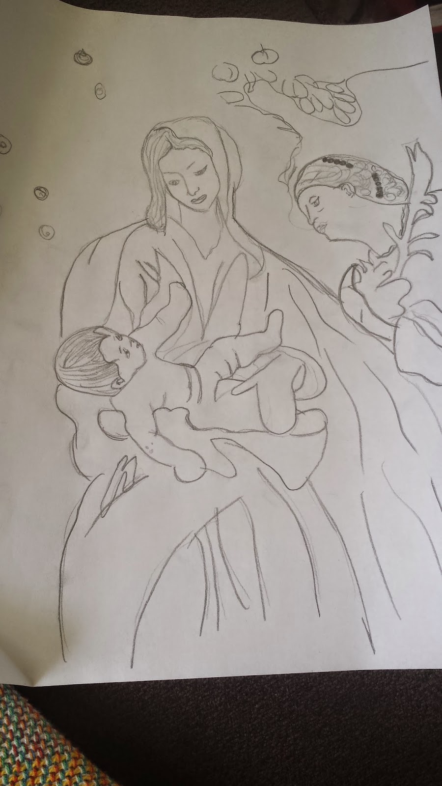
     Virgin of Child with Saint Catherine of Alexandra by Anthony Van Dyck made during 1630 in Antwerp is an example of baroque art. The medium used was oil on canvas. The dimensions used are 43 by 35 3/4 in with added straps that are 44 1/8 by 37 in. The infant is Jesus responding to Saint Catherine, who is a former princess identified by the pearls in her hair and the martyr’s palm. Saint Catherine was in awe by the young woman because of her mystical marriage to Christ. The apples above the rose to the upper left refer to Christ. The formal elements that classify this painting as baroque art is the dramatic use of light and dark creates the illusion of depth of space, and makes the figures more realistic bringing out dimension. The ornate painting makes the viewer almost want to touch it because of the vivid realism. The energy and feeling is strong as the viewer sees the admiration and emotion of all the figures as it tells a small story. Composition of the painting looks and feels complete as the elements come together.

Tuesday, March 24, 2015

Online Assigment # 2


When a piece of art has unity it makes sense. As a whole it looks balanced and all the elements and structure belong together. Artist can unify their work in a couple different ways. One way is color. Color can help balance out a piece of art by using a single color or complimentary colors. Even using a color scheme that is monochromatic or analogous or both can make a piece of art unified. The colors artist can use are endless. Another way to unify art work is shape and size. Shapes can bring dimension to a piece of art. Shapes can be geometrical or organic. Size can help add variety to art work and help us determine what our focal point is. Repetition is another way a piece is unified. If the element is constant and repeats it self multiple times it causes a balancing effect because all you are seeing is something that is constant throughout the piece. Artist can use multiple combinations of techniques to achieve a unified piece. 

                                                        Claude Monet’s Rue Montorgueil in Paris, Festival of June 30, 1878.

The arrangement of were the flags and people are creates unity. The flags that are placed on each side to help balance out the people. The size of the people and flags go from big in the front to small in the back. The colors of the flag and people are repetitive. The constant repetition of theses elements creates unity and variety on the canvas.
                                                                        Lavinia Fontana. Noli Me Tangere. 1581.

Asymmetrical balance is when both sides are not the same but multiple elements are balanced using size,color and form. An artist can uses these elements to create an asymmetrical balance. This is an example of an asymmetrical balance. The oil painting is not symmetrical because it is not the same on both sides. The left and right sides are different but the painting creates a balance as if it was symmetrical. The size of the form of the woman and man on the right side is larger then the three form’s in the back on the left side. The colors on the woman in the front created weight because of the warmth of the dress and the sky’s light helped by giving a glow like her dress. Similar in color but the sky is lighter then her dress. While the man in front does not disturb the painting because he also helps balance the tomb on the left in the back and his clothing helps brighten the painting just like the sky. The three figures in the back help balance out the front because of the size as well as the color. The right side is lighter then the left side and the left side is darker then the right. The women in the back with a red orange dress helps dye down the brightness of the man’s clothing. The darkness on the left also creates depth of space and the illusion of the painting looking like its dimensional. 

                                                            Ron Mueck (Australian, b. 1958). Mask II, 2001–2002. 

Scale can change the meaning of artwork because it can change the viewer point of view and create a different emotion. This appears to be a man sleeping but it actually a relatively large version of a man sleeping. This is realism that is extreme which is called hyperrealistic sculpture. This sculpture represents features of Ron Mueck face on a super human scale. The combined effect of accurate proportion and hyperrealistic detail of the human face looks as if the artist cut off a giants head and put it on a huge block. 


Wednesday, March 18, 2015

Online Assignment # 1


 Relief of Queen Nefertiti, 1352-1356 BC is a relief sculpture carved in Karnak sandstone. The height is twenty-two centimeters and the width is thirty-two centimeters wide. This sculpture shows Queen Nefertiti raising her arm to symbolize her offering to Aten. On top of her head she is wearing an elegant wig. Above the wig originally was a towering crown of uraei, sun disk, two cow horns and two feathers. Behind Queen Nefertiti is hieroglyphs and in front of her it is said that the rays hitting her face and arm indicates that the sun disk was directly overhead. Her facial features are exaggerated like some of the pieces of Amarna art.


Parthenon frieze, Greek, 438-432 BC is a carved sculpture on a marble block that was placed by the corner of the west frieze of Parthenon where it turned on to north. The height is one hundred centimeters long. The horsemen appear as if they are moving at a fast pace but are pushing back so they do not ride off the edge of the frieze. The horsemen in front is twisting his torso to his fellow horsemen with his arm raised up and his hand disappearing to the back of his head. The clothing is draped and helps show the movement of this piece. The body is shaped in a strong manner that could possibly indicate strength and youth. 


Egyptian and Greek art techniques and style are completely different from each other. Relief of Nefertiti is telling a story that shows exaggerated features, symbolism of worship, and has words (hieroglyphs) written on the stone. The body portions are exaggerated like a cartoon that looks fun and interesting. The hieroglyphs on the side has meaning and shows that art can be communicated in words. Egyptian art has lot more to do with rituals, symbolism, exaggeration and story telling. While the Parthenon Frieze is natural. Depending on the viewer you can image the conversation these horsemen have exchanged and the possibilities are endless. Horseman clothing and the horses show movement as if this work of art is moving with you as you pass by it. Greek art shows more naturalism and shows movement which tells a story but can vary between viewers. Egyptian and Greek Art may be very different but if we compare the sculptures they both are telling us a piece of history and they are both sculpted beautifully.


Citations 
http://www.metmuseum.org/toah/works-of-art/61.117

http://www.britishmuseum.org/explore/highlights/highlight_objects/gr/h/horsemen_-_west_frieze.aspx